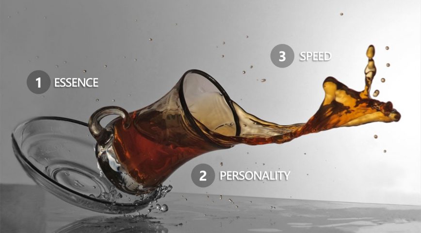
You’re too slow!
Come on Designers — keep up! With new books out on Design Sprints and Lean UX, the dozens of rapid prototyping tools now available, and thousands of Designers who can code up their own ideas, you’d think that the Design community was moving faster than it ever has. But, that’s just not true.
“Design is doing some stellar work these days, but it isn’t moving as fast as we need it to. Compared to the pace of Engineering or even Data Sciences, we seem to be stuck in the past — clinging to old methods and mindsets. It’s time to change that.”
The fact is, the Design discipline itself is still relatively slow and way too self-conscious to go fast. Blame it how it’s taught in schools I suppose, but Design as a whole has never really come to grips with just being done, letting go, and moving on.
Conversely, I see Developers coding and Makers hacking as fast as they possibly can when new opportunities arise — all done with little planning, researching, and exploring (as many Designers often do first). As both a Designer and Coder, I understand each discipline’s methods, yet I find it puzzling that Design seems to be going in slow motion comparatively.
So, here we are — the bottleneck in the development process. Ironic isn’t it? After all those years of complaining about Developers being too set in their ways to go faster, Designers are now the problem.
How did this happen?
I’ve been right in the middle of this shift over the last few decades working as both a Designer and Coder, so I can see it from both perspectives — but it’s still a bit puzzling.
From the Engineering perspective, the rapid influx of freely available coding platforms, great toolsets, agile development methodologies, and young hackers just wanting to kick ass has quickened the pace of just about every aspect of a product team’s lifecycle.
Even Data Science is helping teams go faster. Data usage has become such a ubiquitous and expected part of the process that it’s now strange to not use it to adjust in-flight plans or react to unforeseen situations. Data is rapidly becoming “The Decider” for teams rather than relying on a more people-centric Design Thinking approach (that’s a post for another day).
In comparison, the process of Designing remains slow and still clings to the methods of the past. You know what I’m talking about: indulgent explorations, multiple rounds of iterations, tiered approval process, nitpicking minutiae, and last minute “improvements” by management.
All that said, there is hope.
Turning this around
Getting impactful Design done more quickly is not about working smarter or even harder. It also has nothing to do with learning the flavor-of-the-month design thinking methodology or how to effectively do rapid prototyping.
We can accelerate getting to “done” by leaving out some steps of our traditional Design processes, and not being afraid to leap ahead based on experience and gut instinct.
“Wow. Really?” say many classically trained Designers. “That sounds ridiculous. How can you do stellar work without user research, rigorously exploring the design space, iterating on designs, testing things out, refining them, or even starting over? Are you saying taking shortcuts in our process is the answer?”
Yes 🙂 Go from A to B. Don’t look back. 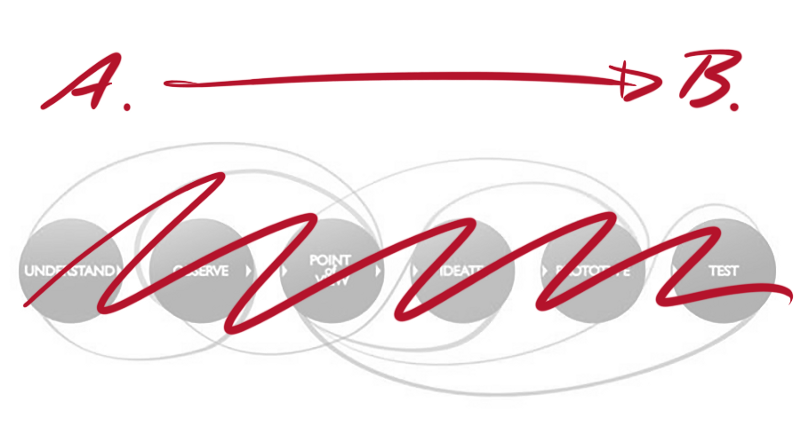 Trust me, using this shortcut approach isn’t as crazy as it sounds. Experienced Designers tend to do some best work when they are under time pressure. Not perfect perhaps, but good nonetheless. There will still be days you go home shaking your head in disbelief at the tradeoffs and shortcuts, but more often than not it’ll be for a good reason — you actually jammed something out at light speed that you feel really good about.
Adopt the mindset that not everything you produce will be truly great, but it will be finished and represent your best effort given the speed at which you were working to help the team move forward quickly.
In that spirit, let’s do a quick experiment — set your normal way of working aside for a few minutes so we can discuss how to accelerate being done.
INTRODUCING : FAST DESIGN
There’s no magic here, just common sense — if you need to go faster, find the quickest route from A to B. For any given task, envision what it looks like being done, and then go as fast as you can to make it real.
Chances are you’ll need to let go of a lot of your old process along the way. Don’t be afraid to just hack things together. Take shortcuts. Do whatever it takes to be done, and then let go. Move on to something new.
Try focusing on just a few things: 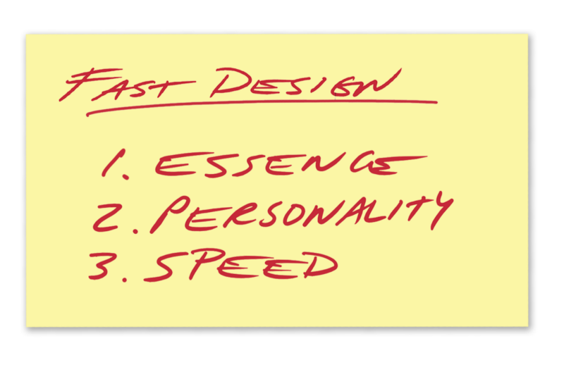 You probably do each of these already as part of your current Design or Development process. The difference here is that you may not consciously call these particular aspects out as important ways to streamline your process. They typically blend into the work or don’t get acknowledged if you don’t think about them as discrete steps or important achievements.
Let’s try this out…
1. FIND THE ESSENCE
 Think of this as the one thing you could say to someone that would simply describe what your doing and immediately make sense to them.
I can’t overstate how important it is to identify the essence of your project when you’re first getting started. It acts as a beacon to guide your Design decisions and something to tenaciously hang onto throughout the entire development process. It’ll need to come through in how you describe what you’re doing, and be present in any interface or promotional material you create.
Whatever that ends up being, the essence needs to shine through clearly to anyone who sees your work for the first time.
Method
Finding the essence has to be done quickly. Don’t overthink it.
- Gather a few people from your team. Diversity of viewpoints is important.
- As fast as you can, jot down several words or phrases on a whiteboard or piece of paper that embody the essence of your project.
- Use the first thoughts that pop into your head. Let the ideas flow, good or bad. It’s more about speed. Should not take more than 5–10 minutes max.
Just like standard brainstorming, the key is to do this step without editing yourself or your teammates ideas. You’ll be surprised how well this works to encircle the essence and hone in on a few key aspects.
Example
When asked to quickly develop the overall experience and visual identify for the world’s biggest corporate hackathon, The Microsoft Garage team almost immediately recognized that events like this are never about the technology or methods used to hack together projects — it’s always about the people themselves who have come to participate. They want to have fun and learn new things. So, it was very natural to feature people as the essence of everything having to do with this global Hackathon event.
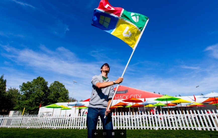
We tried to make sure decisions we made—from the point of finding our essence on—embodied that spirit. Keeping essence front and center throughout all aspects of your project may be difficult, so don’t force it. Keep returning to the idea as you make progress and double-check it’s clearly still there.
Remember
You can’t identify something’s essence by using data — it’s a gut feel thing.
Exercise
Q: What’s the essence of a calculator?
2. IDENTIFY ITS PERSONALITY
 It might be hard to imagine applying human attributes to a piece of software or some print collateral you may be working on, but it’s an important part of bringing the idea to life in the way you first envisioned it.
Q: If your project was a person, how would you describe their personality?
What would they act like?
What would they look like?
How do they sound?
I’m not saying you need to anthropomorphize every project, but do give it some human qualities that are immediately recognizable and reinforce the feel you first envisioned.
Method
It turns out, describing personality is one of the things people find easy.
- Quickly jam out some ideas for your project’s personality by asking people what words would describe the type of person you picture the project being most like.
- Identify just two or three words that best capture the personality you’re going for.
- Find photos or images that help reinforce the feel your going for and keep them visible in your workspace.
This step is far easier than a traditional brand definition exercises because we all can describe people way faster than amorphous brand concepts. And as a bonus, it’s actually a really fun to do this part. I guarantee you’ll be a bit surprised by what people come up with.
Example
We rely on personality quite a bit to help with communication pieces in The Garage. Because people are so busy these days, they often only see these comms pieces very briefly. So, we need to not only make an impression but also be as clear as possible.
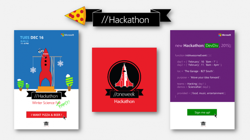
The poster for our Garage Winter Science Fair event (left) tried to capture how the event would be fun and wintry, not at all like your boring old high school science fair. In fact, our design goal was to create the world’s coolest science fair — that’s where the idea of turning it into a fun party atmosphere came from. We even arranged for live appearance of the legendary Clippy. The poster reflects all of that.
Doing a Hackathon for our Developer Division (right) was an opportunity to embrace coding culture and speak the same language as our audience. In perhaps another first, our event poster used valid JavaScript code as the language to invite the participants. We even made sure it was truly authentic for this audience by testing the code would execute properly.
And finally, evolving the hackathon event year to year takes some thought about what personality we want to portray. The infamous “pizza arrow” design (center) made a pretty quick connection with the Devs.
Remember
Personality is memorable. Have some fun with it.
Exercise
Q: What celebrity best embodies your current project? Why?
3. MAINTAIN SPEED THROUGHOUT
 Design fast. It’s critical to move quickly through the entire process of making your ideas real to see the benefits of this method. The fast pace keeps you from drilling in too deeply or going off in alternate design directions (which is counter to how we generally do design work). Keep moving. Using your instincts to make quick decisions is just as important as being data-informed in other methodologies. Your experience will help guide you.
Leave out unnecessary fidelity steps. Rather than following the traditional method of moving from whiteboard sketch to wireframe to prototype to high fidelity comps, try going right to the final form of your output for speed. You may be surprised at how well that works to lock in to your decision and keep the velocity up.
Method
Consciously go faster than normal. Uncomfortable is good.
- Now that you have found the essence and identified your project’s personality, go back to your first thoughts on what it would be like when finished. Sketch out a few different tries of that final execution.
- Figure out how to get from what you just envisioned to the final deliverable. How much of this can you do yourself? What help do you need if any?
- Just do it. Go directly from sketch to final medium, working things out as you go. If you can’t finish it without help, use the appropriate rapid prototyping techniques to get as close as you can to final before needing to collaborate or hand-off.
We have found that Fast Design techniques can cut your overall execution time by 10x without substantial loss of quality. You do need to focus though, as you’ll see in this next example.
Example
Designing faster can sometimes come with tough lessons.
Our Hackathon logo design from last summer is a good example of something that normally takes awhile to finish (given the high number of places it would be leveraged, management approvals, etc). This year, using Fast Design, it only took about a day to conceptualize and execute as a final piece of vector artwork. Score! That would normally be the end of the story.
However, we ended up making a mistake in the process.
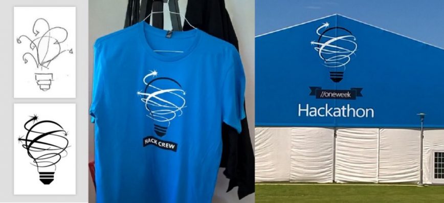
As we shifted into production mode it became apparent the logo wouldn’t have enough contrast for certain blue backdrops our Event team was favoring. Not unusual. Designers know all-too-well that two-tone combinations for print usage are tricky to get right first try. It was close, but not good enough for the visual identity of a major event.
The final logo we turned in had to be fixed.
As it turns out, this ended up being a good thing because there were many other situations that arose where we needed that type of color contrast, too. But being honest, it’s never fun to discard or replace finished work. Lesson learned. And we’re all better for the experience.
Q: Does that mistake mean the process is broken?
Not at all. In fact, you could say being forced to learn and grow from every new cycle is one of its most important aspects of working this way. You can’t be afraid to mistakes or even fail a few times along the way in order to increase your pace.
Remember
You are going to make some mistakes— just keep going.
Exercise
Create a T-shirt design for your project in 30 minutes, start to finish. 
Conclusion: We can go faster — let’s do it.
The Fast Design approach outlined here can not only help you keep pace with the speed of development, but it will almost certainly make you a better Designer and contributor. I’m not saying this is perfect (in fact it’s an evolving experiment), but it does get us working at the speed of our teammates from other disciplines like Engineering and Data Science. We’ll all get better as a result.
On a personal note, this method of intentionally designing more quickly at every turn has helped me deliver more finished pieces in the last year than ever before in my career. I honestly have forgotten more things than I can remember doing.
There’s another important aspect this shift — your job becomes more about helping your team move quickly than about you creating a perfect single piece. And that’s the way it should be in the modern world of work.
I learn new things all the time using Fast Design, and it helps keep me humble and open to new ways of approaching tasks. I’d be surprised if it didn’t work for you, too.
See you out there, designing faster.
![]()
About

Mike Pell leads Design for The Microsoft Garage, the company’s outlet for experimental projects worldwide. Connect with him on Twitter, LinkedIn, Medium, or his website.
